Usability Testing Results
Test A – Primary personaName: Jay Hsu
Age: 22
Profession: Student
Type of Persona: Primary
Date and Time of testing: 11/5/11 7:00 pm
Duration of Test: 15 Minutes
Questionnaire Results
1) What is your age group?
20-29
2) Were you born in Chicago?
No
3) About how often do you surf the Internet on your cell phone?
Daily
4) Do you have a computer at home?
Yes
5) Do you enjoy watching sports?
Yes
6) Are you a fan of any Chicago sports teams?
Yes
a) If yes, which ones?
Bears, Bulls, and Cubs
7) Do you check game times on your phone?
Yes
8) Do you check scores on your phone?
Yes
9) Do you like to read sports news?
Yes
10) Would you like an easy way to find scores, schedules, and news on Chicago sports teams of your choice?
Yes
Initial Prototype Reaction
What is your first reaction to the site?
Concise, clean design
What is appealing to you and why?
Information is immediate, without excess irrelevant information
Who is this website built for?
Chicago sports fans
Does this seem like a website designed for someone like you?
With some aesthetic improvements, yes.
Recorded Rest Results
Task 1: Post a comment to an article| Time: | Notes |
| Participant action:
|
|
Task 2: Create a user account
| Time: | Notes |
| Participant action:
|
|
Task 3: Find game information:
| Time: | Notes |
| Participant action:
|
|
User Satisfaction Questionnaire
1: Post a comment to an articleDid you complete the task quickly and easily?
Yes
Was it the information you expected?
Yes
Are you pleased with the steps taken?
Template needs to be fixed
Did you complete the task quickly and easily?
Yes
Was it the information you expected?
Yes
Are you pleased with the steps taken?
Functional, could be touched up
Did you complete the task quickly and easily?
Yes
Was it the information you expected?
Yes
Are you pleased with the steps taken?
Yes
Debriefing
What do you think of your first experience with our site?
Easy to use, some aesthetic improvements could be made
What was the most useful aspect of the site?
Information was easily found
What aspects of the site were ineffective?
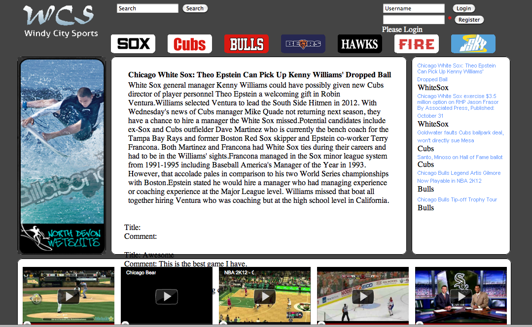
Comment box was blocked by videos
What improvements do you suggest for the site?
Slight template fixes and aesthetic changes (font/formatting)
Summary
Summarize the user’s experience in completing each task:
Task 1: All of the users who were tested had difficulty commenting on an article. One user could a see the comments but was unable to submit their comments. In other tests users complained that the videos inhibited them from viewing the comments field.
Task 2: None of the users tested found this task difficult. One user thinks that the user login fields should not be visible one the user has successfully logged in.
Task 3: None of the users fount this to be a difficult task. One user had difficulty navigating back to the calendar once they had entered a game. Overall the users thought this task was really straight forward.
What task did the user have difficulty with?
The users experienced difficulties commenting on an article for several different reasons. Some had trouble submitting a comment once they had written it. Other users could not access the comments field at all.
List of changes to the site
the changes you plan to implement to your site as a result of the usability testing
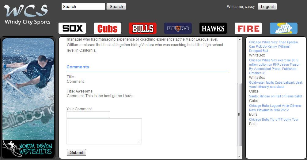
Change 1: Modify the comment module. Make the comment session easier to access.
Change 2: Improve the login module. Replace user name and log out button with login fields after user logged in.
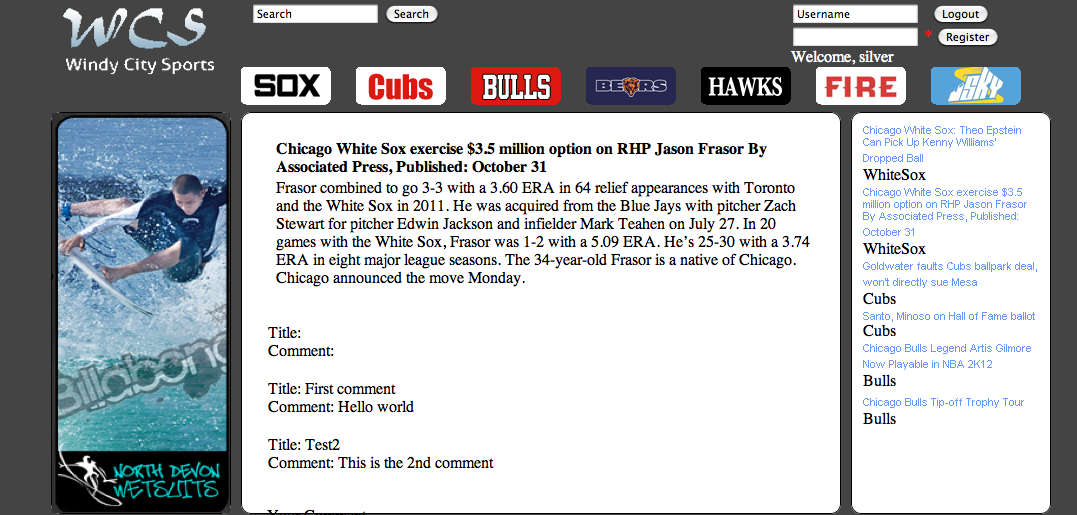
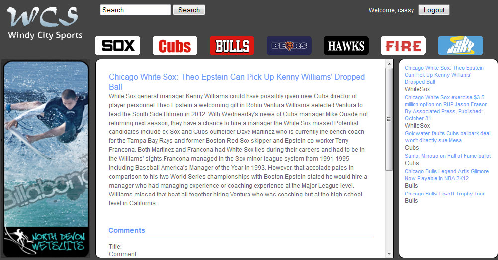
Change 3: Slightly change the style of the article page
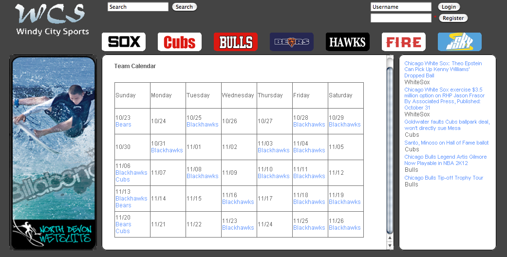
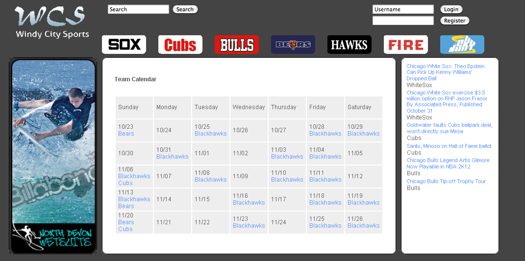
Change 4: Improve the look of calendar
Provide before and after screenshots of changes
Change 1:
Before
After
Change 2:
Before

After

Change 3:
Before
After
Change 4:
Before
After
Contribution of members
Chen, Pou-Chang | Coded the website, deliverable website |
Hines, Melvin | Built the database for the website |
Mulholland, Zach | Test Guide, Final Editing/Formatting |
Sendi, Abdeen Muneer | Took Screen-shots of the changes, collecting site contents |
Yuan, Qiong | Front-end work on the website, came up with changes |